Oct 1, 2024
InQueery Media editorial illustration in print!
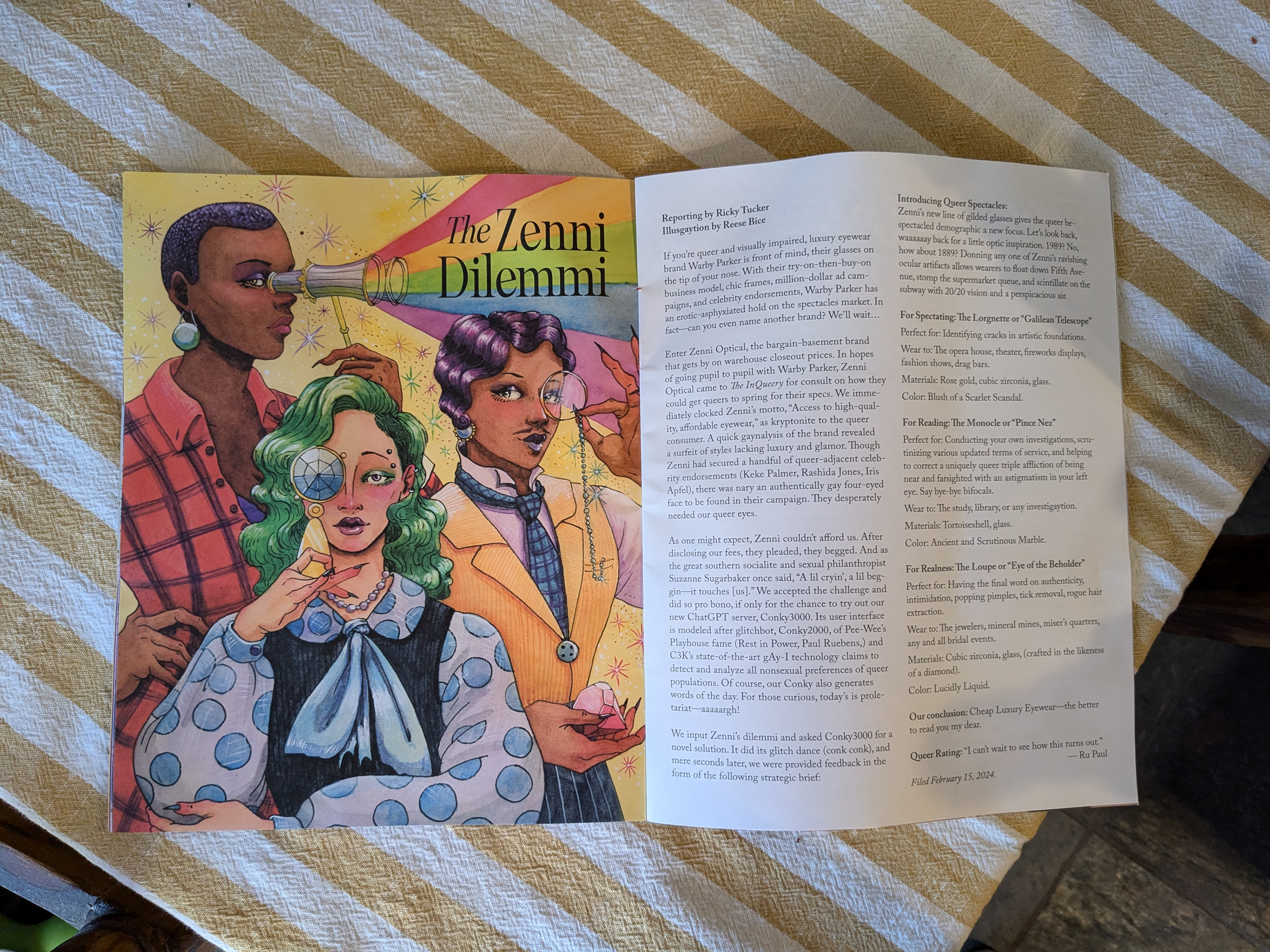
So exciting to finally see my illustration for InQueery in print! Thanks to AD Greg Kozatek.
August 10th, 2024
3x3 Magazine Annual 21 Merit Award
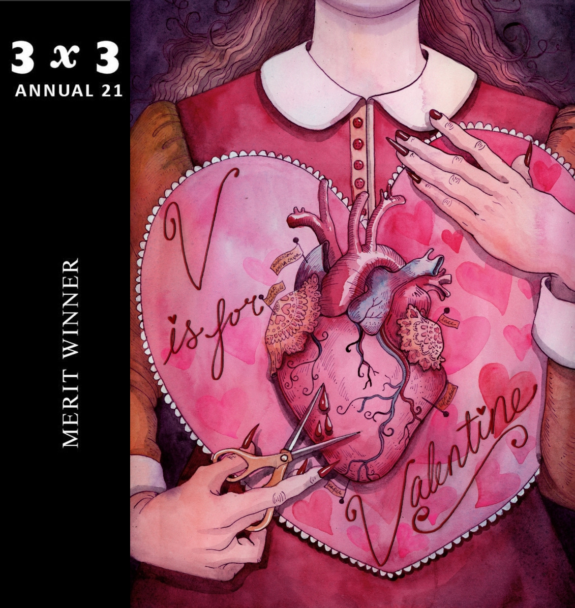
I'm excited to announce that I received the Merit award for my V is for Valentine poster! I do a poster for Fancypants SF quarterly to promote their drag variety show, which boasts a colorful roster of performers and fabulous art direction. Every show has a theme, encapsulated by a "V" word; hence "Valentine", which the show explores through musical acts, spoken word, comedy, lipsync, and food! It is more than a drag show; it's more like an immersive cocktail party combined with a dissertation.
I'm very excited that my work for Fancypants is being recognized by an important illustration institution, as I love my small/indie company clients and I love to work with other artists.
Many of my other Fancypants posters can be found in my portfolio!
Check out Fancypants SF here:
https://fancypantssf.com/
July 25, 2024
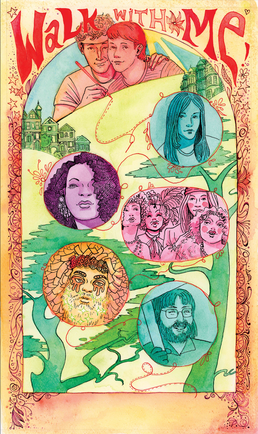
"Walk With Me" San Francisco Walking Tour Poster
I heard about this project from my friend Chris Steele who performs in Fancypants, a show for which I regularly make poster illustrations. The lead on the project in conjunction with Chris was Seth Eisen, who has directed multiple live-theater style walking tours of San Francisco. They wanted art for their new app-based tour of the Haight, which could be broken up into layers and used as a complete poster and as separate assets.
Seth was kind enough to provide some folders of reference images for the vibe/aesthetic of the poster, which needed to include portraits of relevant historical figures as well as a portrait of Seth (who guides the tour) and references to the ambiance of the Haight. Because the tour is centered around the queer counter revolution of the 70s, we were looking at zines and poster art from the time for inspiration. Seth also wanted to include a conceptual element of a thread weaving all these things together.
The most challenging part of this brief is creating an image that can be separated into many smaller assets, so that was my main concern in the thumbnailing stage. As usual, I did some brain storming and then submitted three sketches for Seth to consider.
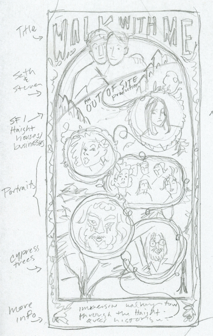
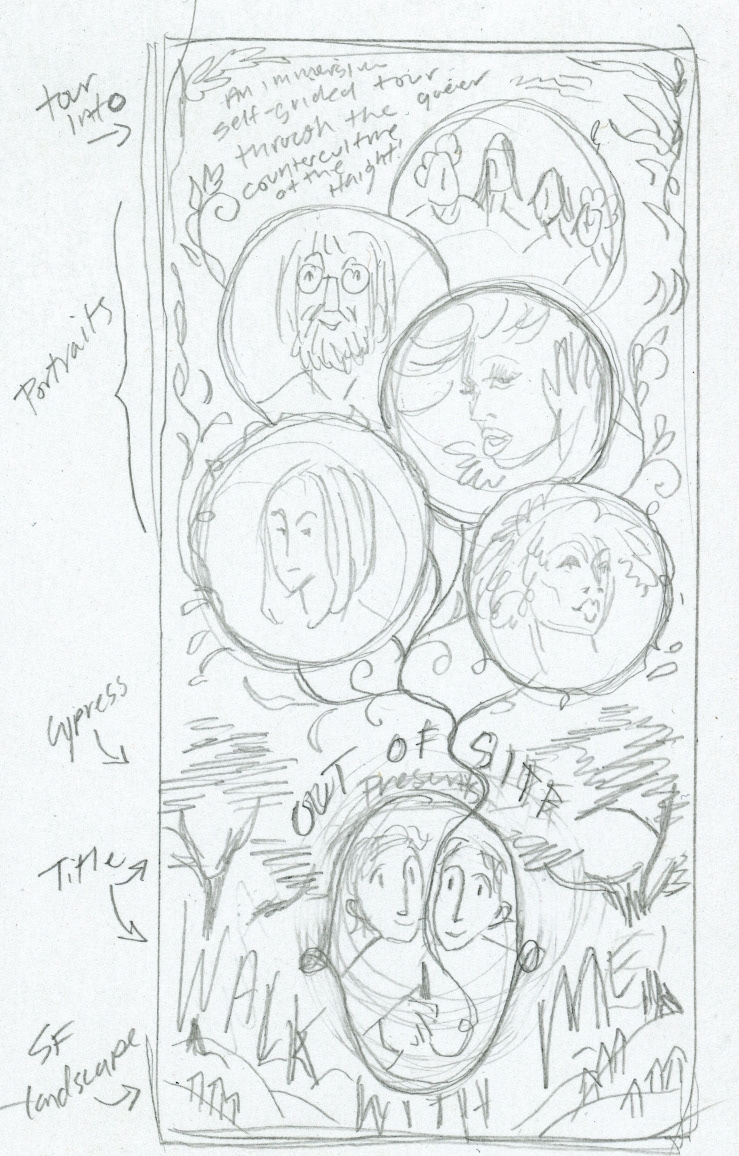
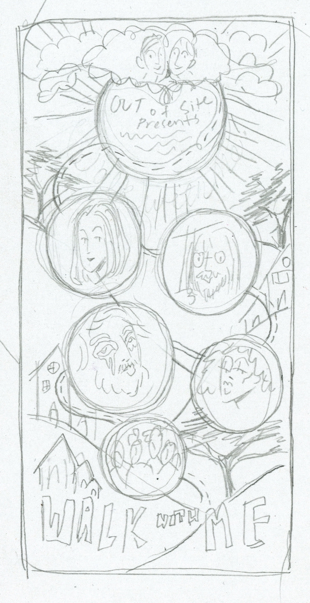
Based on our visual references, I wanted to include a botanical decorative border and incorporate a DIY/punk style. Because the image is destined to be viewed on a phone screen, I was working in a 16x9 aspect ratio which was a little strange and challenging. I think stacking the portraits in floating frames was a good solution.
Seth and Chris picked thumbnail A, which was also my favorite. Then I did some color roughs in a very dumb way: I printed the thumbnail drawing three times, then coated the copy paper with absorbent watercolor ground so I could do the color rough traditionally in watercolor.
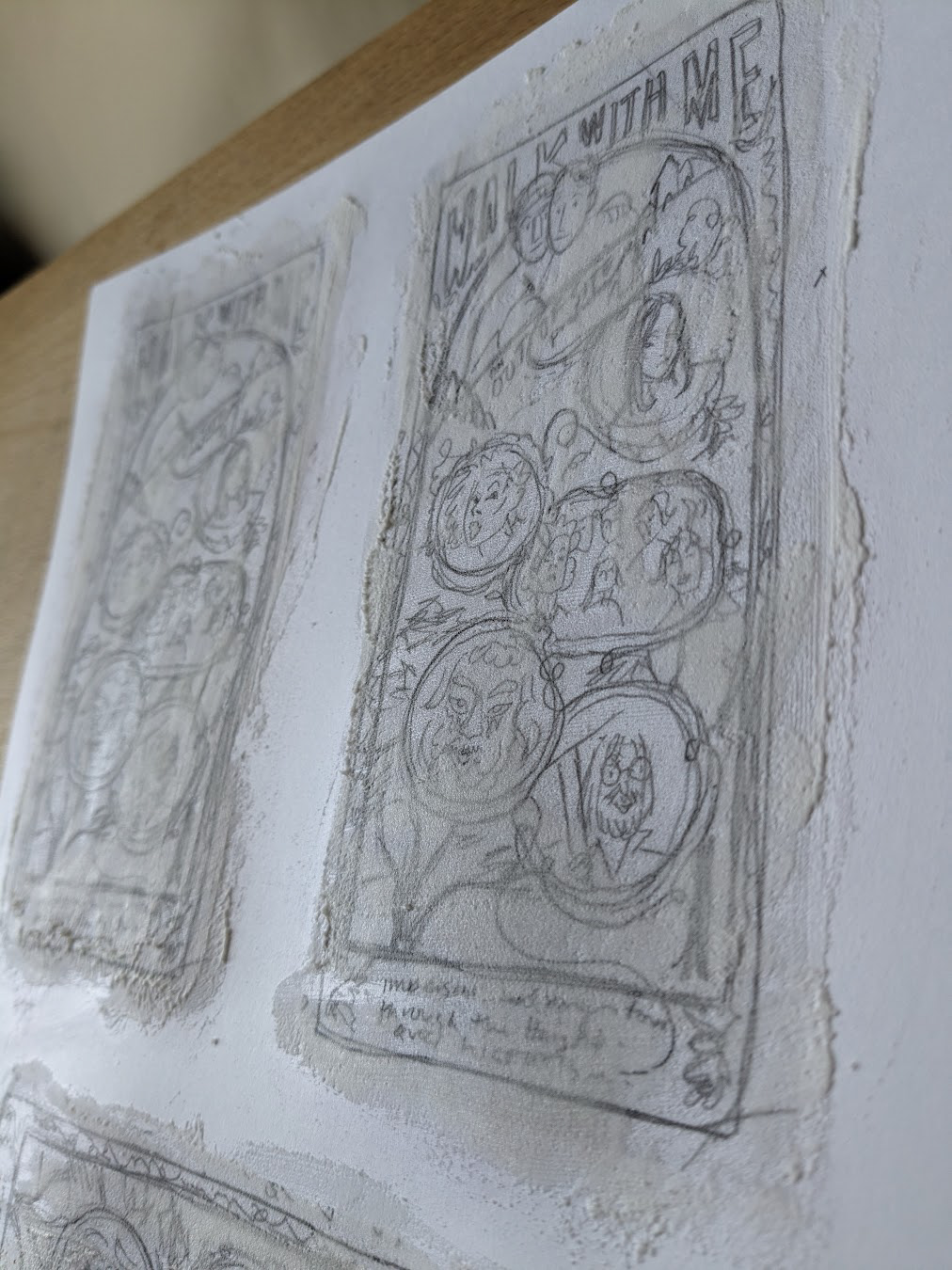
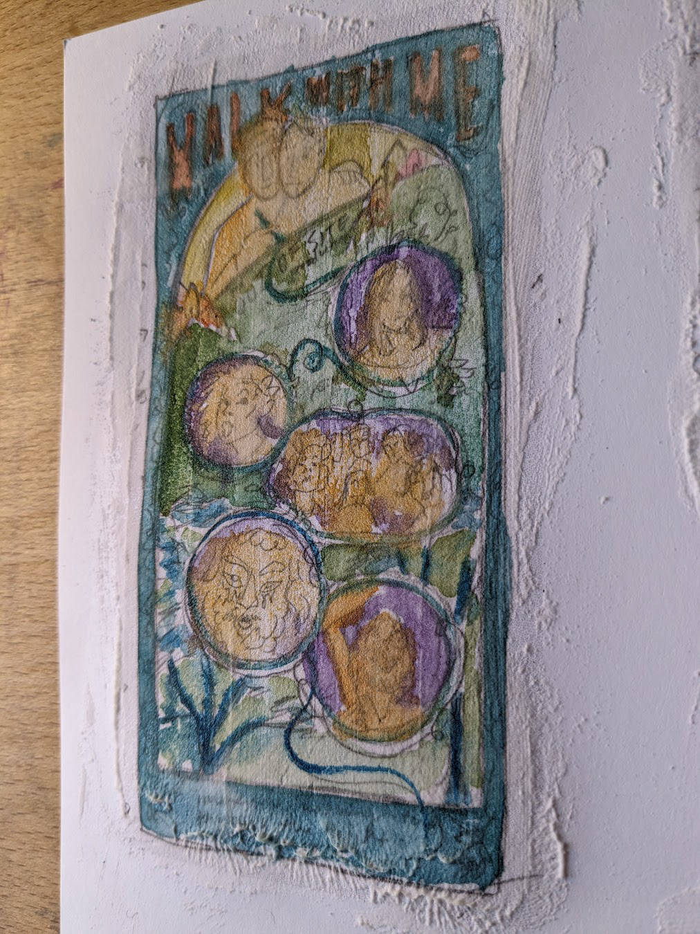
I would not recommend doing it this way, but it did get me accurate color.
After feedback on the colors, I went ahead and made a digital color rough with the final design, and then all there was left to do was move on to the final surface and finish it!